For today’s blog, I want to step aside from podcasts a bit as the primary focus. Today’s blog will focus on an issue that all aspiring YouTubers especially struggle with. Unfortunately, there is not much point in making content if no one watches it. So, how do you get viewers to click on your videos? Even more important than tags, titles, or even good content, is a good, eye-catching thumbnail. That little picture preview is the biggest factor for people deciding to click on your video! So, how do you make people click YOUR thumbnails? Let’s find out!
YouTube has a feature inherently to auto-generate a thumbnail based on a frame from the video. This auto-generated thumbnail works fine enough in a desperate pinch. However, leather shoes work fine enough as food in a desperate pinch, so you should aspire for a better thumbnail. A thumbnail is a relatively simple image, but an important one. You should be able to make it in just about any photo editing software. I personally recommend Photoshop, but due to the price barrier, Photopea and Canva are great alternatives. Adobe does not need any more rookie content creators’ money.
So, now that you have both the video you want to upload and a photo editing program, how do you make a compelling thumbnail? First, never be afraid to “borrow” ideas. Many design programs, like Canva, offer templates for many things, including video thumbnails. These templates can give you a good guide on text placement, font size, color palettes, and general attractive imagery for thumbnails. These templates will be effective training wheels for the basic layout of competent thumbnails.
However, there is one collection of thumbnail inspiration greater than any template list: YouTube. It is never a bad idea to peek at your peers and see what works for them. Popular thumbnails I’ve seen on the platform include a cutout of an emotionally engaging expression from a person in the video, such as a scared scream from someone playing a horror game, text in a clear and contrasting font and color highlight a small aspect of the video, and distinct colors to contrast each object in the thumbnail. Some videos benefit from having a distinct logo in the thumbnail, if the video is part of a distinct series or covering a specific game, for example.
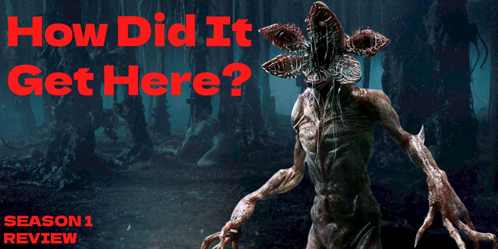
Hypothetically, let’s say you’ve just finished recording and editing a review of the first season of the popular Netflix series “Stanger Things,” in anticipation of the new season releasing in the coming days. A potentially good thumbnail for this kind of video would likely use, recognizable background from the show’s first season. For example, The Upside Down works as a recognizable and eye-catching location. Now that you have a backdrop, what do you put on it? For a review of “Stranger Things” Season 1, you have a few options. I recommend putting at least 1 major face on the thumbnail. Your best bets would be an eye-catching design like the Demogorgon, monsters in thumbnails do well with horror audiences or a popular actor on the show like Finn Wolfhard or Millie Bobby Brown. Cutting any of them out and naturally placing them in the show is your task here. After doing that, I recommend adding a bit of text to catch wandering eyes. “Stranger Things Review,” “Season 1,” or “REVIEW” are all potentially good ideas for thumbnail text. For negative reviews, people love to click on phrases like “What Went Wrong?” Additionally, asking questions, in general, is very enticing to viewers. Asking about the origin of certain things, a potential theory behind something, a questioning of the behind-the-scenes, or any other question to the audience is good for getting clicks. Finally, if you plan on showing your face on video or have a mascot character representing yourself as creators like Saberspark and JaidenAnimations often do, cut out a frame of yourself/your mascot in a compelling expression, and slap them in that thumbnail in a way that looks good to you. I recommend placing yourself on either far side of the thumbnail, so the eye naturally sees you as different than the show’s content, or placing yourself in the middle and highlighting your border, to make it as if you are standing in front of the show. I’ve provided an example of a rough concept based on what I’ve described here today. Since I haven’t filmed this review, I am not in the thumbnail. I recommend almost always pulling your reference of yourself from the video if possible. It can be jarring to have different camera quality or different clothes on the thumbnail version of you versus the video version of you.

If you think what I’ve posted looks like a competent thumbnail, then congrats! You’re ready to make your own thumbnails. Follow the steps I’ve listed and use your creative skills to make some eye-catching works of art! What do you think could be improved about this thumbnail? I’ve left it intentionally simple because I’d like for you to comment below on what you would do differently. Should there be more characters and objects on screen? Should I change the font? Does it need more highlights? Do the infamous red arrow and circle make it eye-catching to you? (Note: I DO NOT RECOMMEND red arrow and circle tactics in thumbnails.) Experiment with this thumbnail or one of your own and comment below what you think works and doesn’t work! If you liked this blog or think you learned something, please share it with a friend! As always, thanks for reading!
Be First to Comment