While I’ve been on the radio I’ve thought about ways to connect with people, relate to people, and become more well known any way I can. You’ve probably thought the same thing if you’re also on air. I have several followers on different social media apps and have self-promoted to a degree with them. While I know that has worked for me by adding more listeners, I’ve thought of another way to get my name and my show’s name out to a larger college crowd. A type of eye-catching, name-throwing, interest-building idea that you should potentially try as well.
It’s worked for hundreds of years grabbing people’s attention, and should definitely still do the trick. I’m talking about creating a poster! The idea that I really want to try this upcoming semester is to create a poster that promotes my radio segment that explains its name, time, and what it’s about. While of course is something that people can’t help but notice if they’re walking past it.


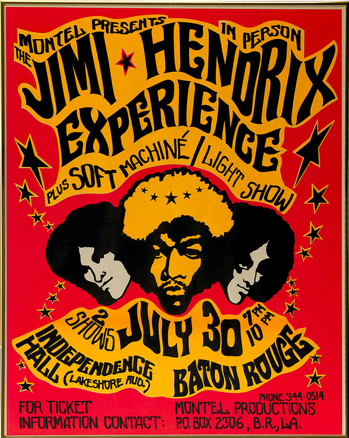
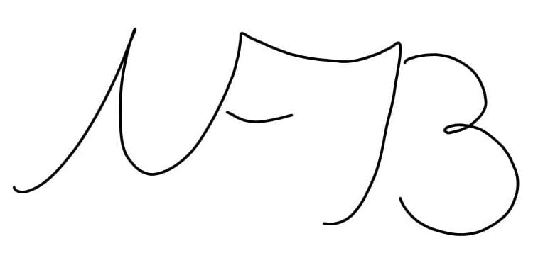
I don’t think it would be hard to understand why I got the idea from band posters of the 60s and 70s. I mean, seriously if you walked past either of those and saw that, it would probably catch your eye.
Now, this is just an idea and I’m not certain this will change how many listeners I get, but when I go through with it, and if you attempt to, we need to find a way to make our posters really stick out while not being too over the top. Take the two above for example. They’re simple yet capture your attention because of subtle interesting colors and fonts. Both have renditions of what the concert headlining bandmates look like, but the Jimi Hendrix Experience poster distorts their faces slightly giving them a cartoonish look. This is what I mean by not being over the top. While the poster looks slightly goofy, it’s not ridiculous.
Perhaps you could do the same type of thing with your poster using your face like above over some text. It’s simple, gets the point across, and hey, if it’s close enough to how you look depending on how it’s made, then you could get recognized from it. I’ve thought of trying this, however, what I may try is to make a poster based on the theme of the music I play. For example, I play modern surf and psychedelic rock while also playing 60s and 70s songs. I’m not sure exactly how it would look, but imagine a page out of a vintage surfing magazine that reads the theme of my show, “The Hangout, Your Source For the Costal Tunes and The Stuff You’d Hear in Formans Basement”. I feel like that would be so cool if it was around campus in heavy traffic spots.
If you also have time on air and think about getting more ears, maybe this idea could work for you. Who knows, this might be the thing that really gets both of us some attention. Let me know what you think of it. Do you think it’s a waste of time, or would you be willing to try it? If you liked my post, consider following me to stay up to date on another day in the life of music and media!
